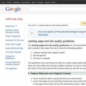
 There is something you must understand about the kind of visitors Adwords traffic consists of: Most of the people coming to your website via Adwords Ads are First Time Visitors. They weren’t sent to your sales page by Affiliates recommending your product,
or after reading a positive review – to these visitors you truly are a complete stranger. This is why Transparency is especially important for Sales Pages advertised on Adwords.
You can check out Google’s Landing Page Guidelines yourself at:
http://support.google.com/adwords/bin/answer.py?hl=en&answer=46675
There’s a lot of stuff to sift through on that page, and most of it isn’t about helping your Sales Page convert better (or even meant for Direct Response websites). So I’ll give you specific examples of what your Sales Page should have in order to improve conversion,
make your potential buyers comfortable and even please Google…
Who you ARE and what you DO:
If you claim to be an expert, explain who you are and why people should trust what you have to say. Talk about your experience and describe your know how in the area you claim to be an expert in. Personally, I often devote a special section of my copy to tell my
personal story – it doesn’t have to be long but should be enough to familiarize your visitors with who you are.
If you’re not selling an info product, but some kind of software or other products online, describe your business and provide business information. Either way listing your business name, contact and information at the bottom of the page helps make first time visitors to
your website more comfortable with the idea of handing over their credit card info within a few minutes of visiting your site.
What your product IS and how it WORKS:
It’s important to be clear about your product., specifically what it IS, DOES and how it WORKS. A lot of people try to trick people into buying their product, vaguely describing what it is in the hopes that benefits and promises alone will convince people to buy –
This is a bad idea, especially on Adwords – it looks suspicious and makes people think you’re hiding something. Here is a simple example below:
“Bodyweight Fitness” – IS a 4 Week home workout program consisting of bodyweight exercises that does not require weights, gym memberships or any special equipment. It WORKS by combining strength exercises with explosive plyomentric exercises, which helps build strength while gaining muscle mass as well as athletic ability…
It’s important that our customers understand exactly what they are getting. So we can further elaborate on the description above with Diagrams and Graphics that help people understand what they are getting themselves into.
Exactly what your customers GET:
Will you be sending a physical Book and DVD to your customers, or is your product 100% Downloadable? It’s also important to give a glimpse inside the product your customers are paying for…
If you are selling a software, provide video of it in action – this gets people familiar and comfortable with your product before they buy. And if you’re selling an eBook, take a screenshot of the best part and stick it in the product description – somewhere close to the eCover graphics. Giving a peak inside your product takes some of mystery and uncertainty out of a person’s decision, which makes them more confident and comfortable giving a total stranger their credit card info over the internet.
Provide Visual Help!
A large portion of your visitors are Visual Learners, and many are Visual Thinkers. These people feel more comfortable when text is accompanied by illustrations and pictures that help them understand the point you are trying to get across. So any
Diagrams, Screenshots, Visual Proof you can include in your Sales Page is a positive…as long as it serves a purpose and isn’t there for decoration.
Ok, so these are a just a couple of ways to make your visitors more comfortable when they get to your site and in turn will help convert more new business.


Connect With Us